Karaya - Multifunctional Social App
Karaya is an innovative social media platform that integrates learning, career development, and professional networking ecosystems in one integrated digital solution. By providing accredited courses, industry-recognized certifications, and insightful interactive seminars, Karaya facilitates optimal skill enhancement. The advanced digital portfolio feature allows users to attractively showcase their competencies, thus opening up access to the best job opportunities with a streamlined recruitment process.

Introduction
Why We Build Karaya?
Mage X UI/UX Design Competition is a national-level competition held by the Department of Computer Engineering, Faculty of FTEIC, Institut Teknologi Sepuluh Nopember Surabaya. This competition challenges UI/UX designers to create innovative, research-based digital solutions.
As the team leader and UI/UX designer, I played a crucial role in ensuring our solution was not only visually appealing but also highly functional. Through this journey, we successfully became Top 10 Finalists, proving that our design approach could compete at a national level.
Team And Role
In this project, our team consisted of two people, me as UI/UX Designer and Team Leader and my colleague as UX Researcher. As the team leader, I was responsible for setting the project vision and aligning the team's goals, making sure every design decision was always followed based on user needs data. I also lead brainstorming sessions to come up with solutions. In addition, I play a role in managing design execution from start to finish, ensuring each iteration has a positive impact on the user experience. Once the prototype was developed, I participated in usability testing, analyzed user feedback, and implemented improvements based on test results to refine the product design.
Problem Statement
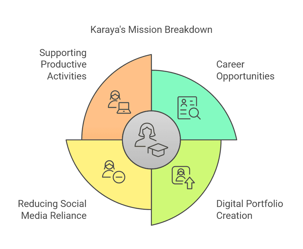
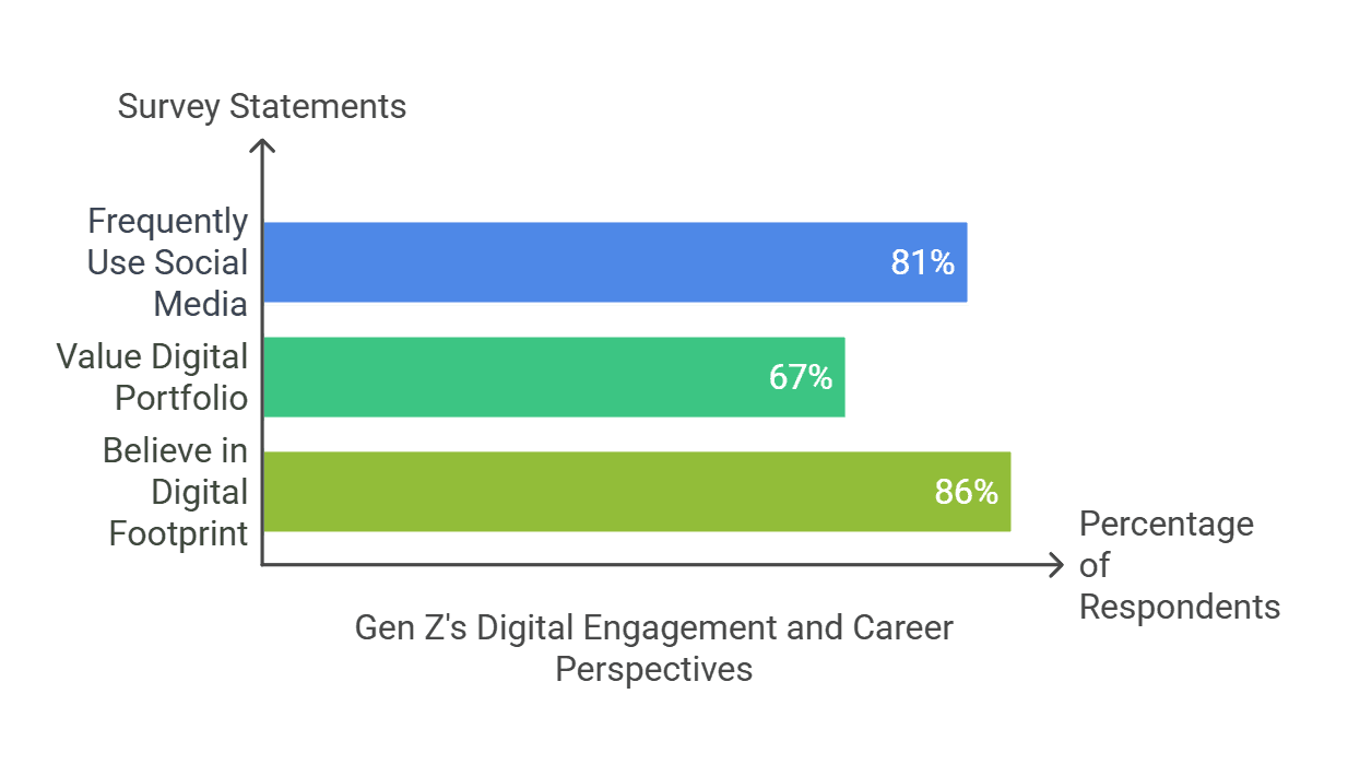
One of the biggest challenges we identified was how to create a social media platform that remains engaging while simultaneously helping Gen Z prepare for their careers. Based on our research, 81% of Gen Z users struggle to find career-building platforms, while 67% want to build an online portfolio but don’t know where to start. Most existing platforms prioritize entertainment over productivity, leaving a significant gap in the market.
Objective
Karaya was designed with a primary purpose:
Key Takeaways
Listening directly to user needs is crucial to creating the right solution.
There is a big gap between what Gen Z wants and what platforms currently offer.
Design Process
My Design Journey From Concept to Execution
By applying the Design Thinking methodology, I ensure that every solution is user-centered and data-driven to create user-centric solutions, an iterative five-stage process that starts from a deep understanding of the user experience and their needs (Empathize), identifying key problems (Define), generating innovative solutions (Ideate), developing and testing prototypes (Prototype), and continuously refining the design through real-world testing (Test) to maximize effectiveness and relevance.
Understanding the Audience
To gain a deeper understanding of Gen Z's needs, we began by conducting in-depth interviews with Gen Z users to gather qualitative insights into their behaviors, preferences, and pain points:
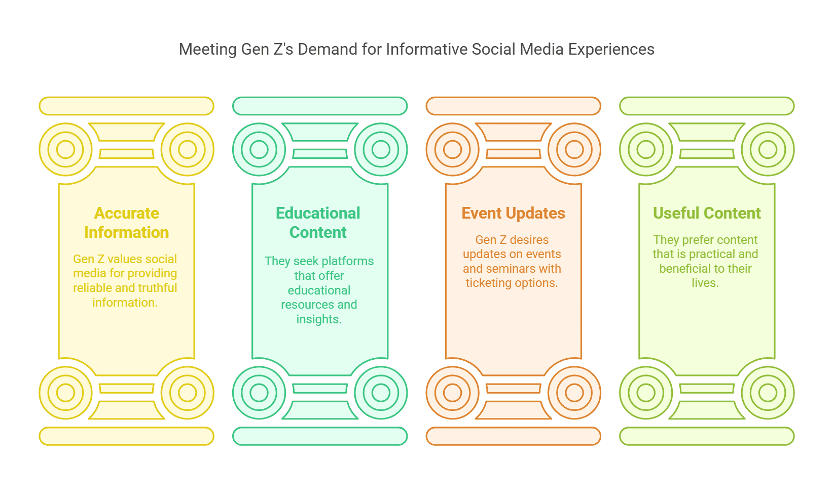
After identifying key patterns and common themes, we expanded our research by conducting a survey using Google Forms. This allowed us to collect quantitative data from a larger user base and understand Gen Z's expectations:
Who Are Our Users?
After collecting and analyzing the data, I summarized the findings into project user personas. These personas include detailed information such as demographics, goals, motivations, pain points, and behavior patterns.
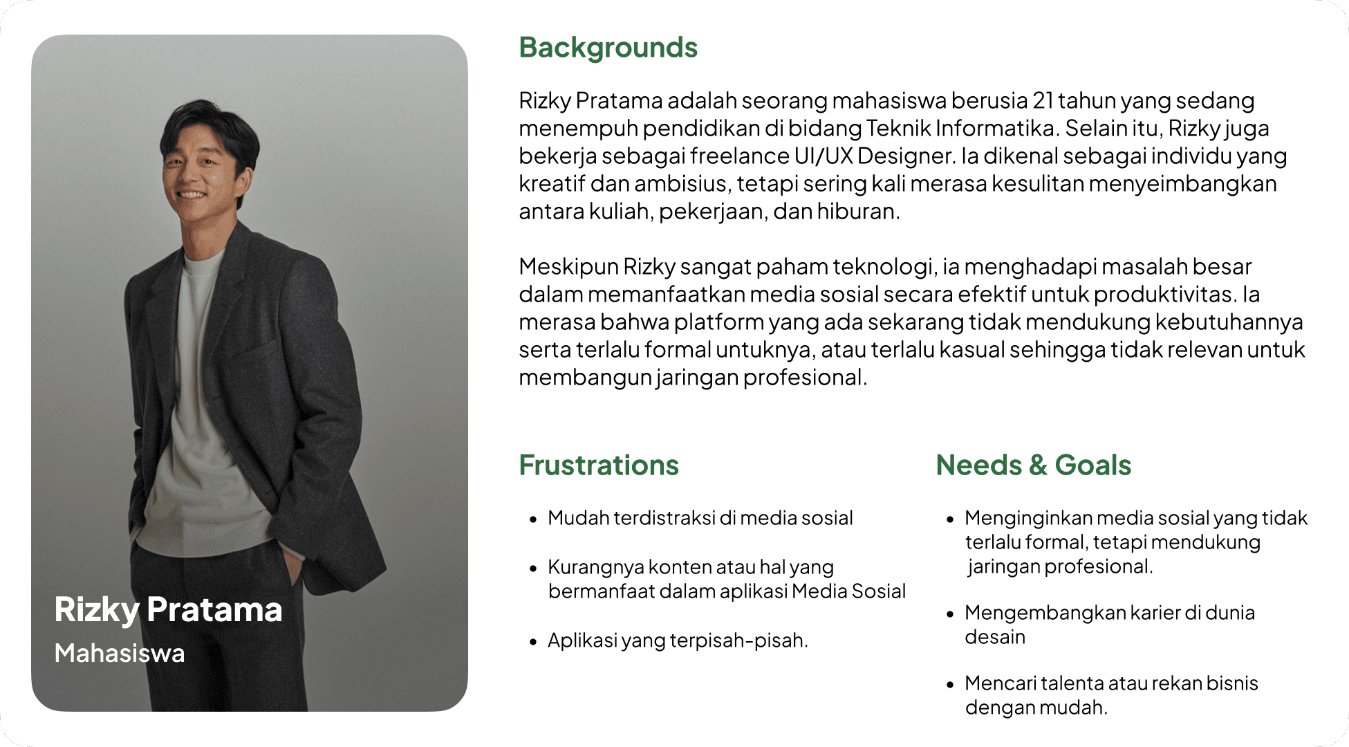
To ascertain the personas I discussed with the team to evaluate the shortcomings and needs of the personas. These discussions led to a good persona result and we were able to create a solution that really met the user's needs and increased overall user satisfaction.
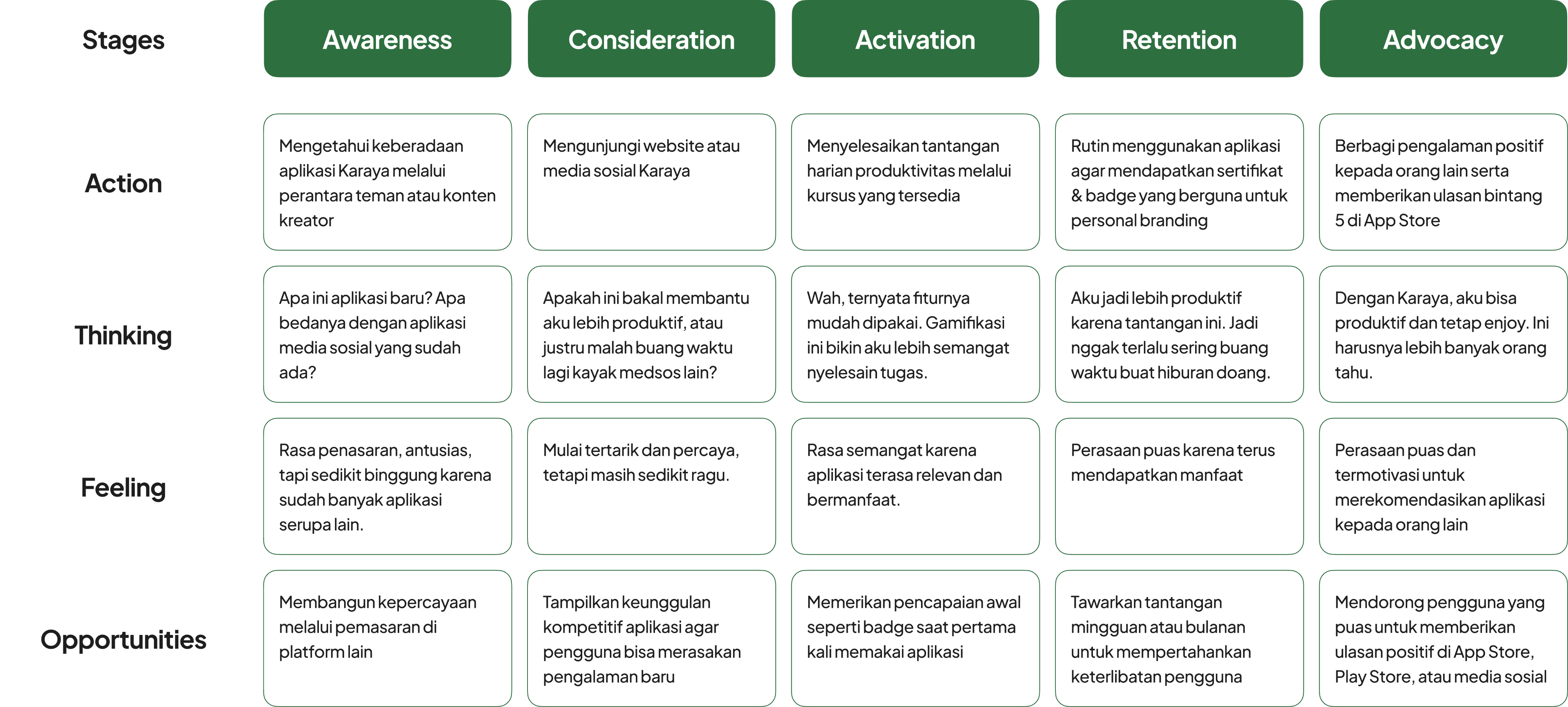
Users Step-by-Step Experience
Once the User Persona was created, I took the lead to start designing the User Journey to understand and improve the overall user experience. This process started with in-depth research into the user's behavior and needs when using the platform, which I then mapped into stages of their interaction with the app.
Mapping the Core Issue
Based on our findings, we identified a key challenge:
Gen Z lacks an integrated platform that supports productivity through portfolio, learning, and networking, while still offering an engaging experience like conventional social media.
We identified the key issues that informed the development of this product. Gen Z needs an integrated platform that not only supports productivity such as portfolio creation, learning, and networking, but also still delivers an engaging interaction experience like any other social media.
Brainstorming for Innovation
In the Ideation phase, I took the lead in conducting brainstorming workshops to generate innovative solutions.
The brainstorming session we generated several solution ideas:
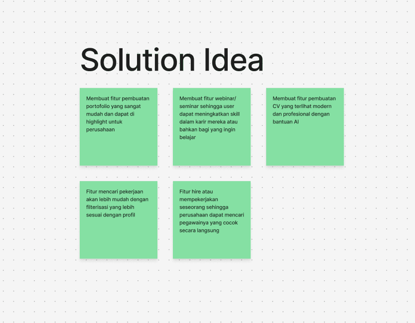
These ideas were chosen because they address productivity needs while maintaining the social elements that will help Gen Z to grow with social media.
My brainstorming contributions included: Portfolio Maker AI, Skill-Based Learning, and a Competitive Leaderboard
Visualizing the Concept
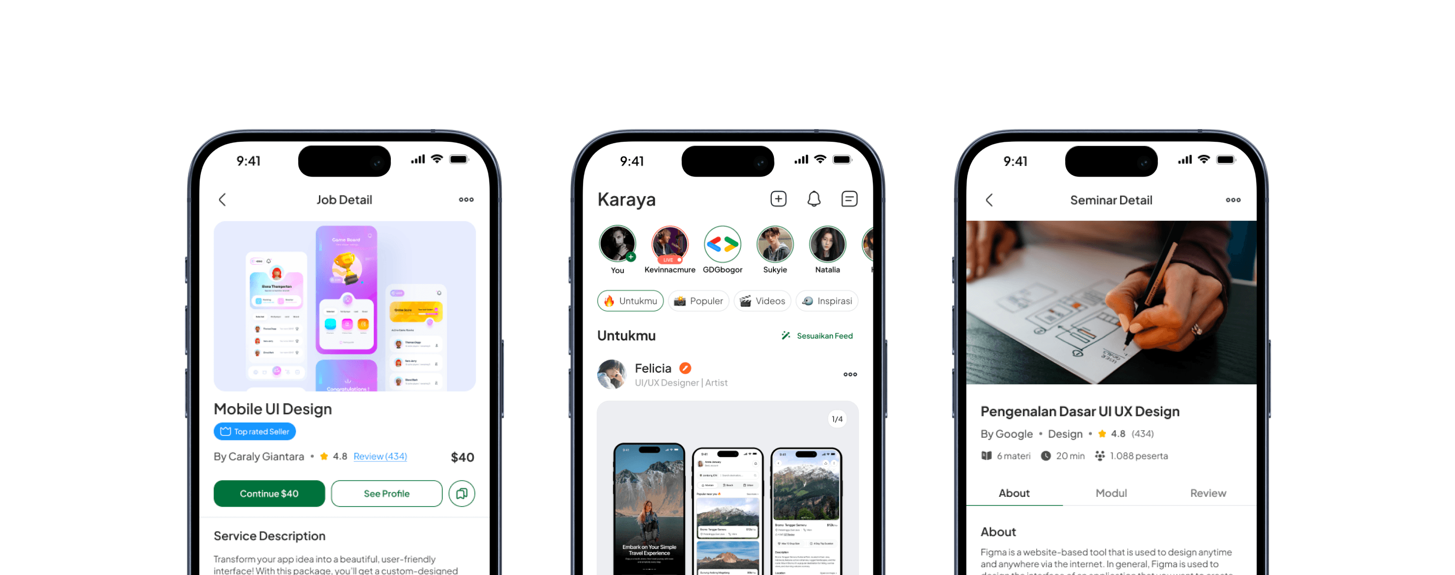
This section provides a visual representation of the high-fidelity (hi-fi) design developed based on previous research and idea exploration. Each element in the design has been strategically arranged to improve information affordability, interaction efficiency, and aesthetics in line with the product's purpose.
Creating the UX Flow
In creating these user flows, I collaborated with the team to understand how users would interact with the various features in the app. Using a discussion and research-based approach, we ensured that each flow reflected an intuitive and efficient user experience.
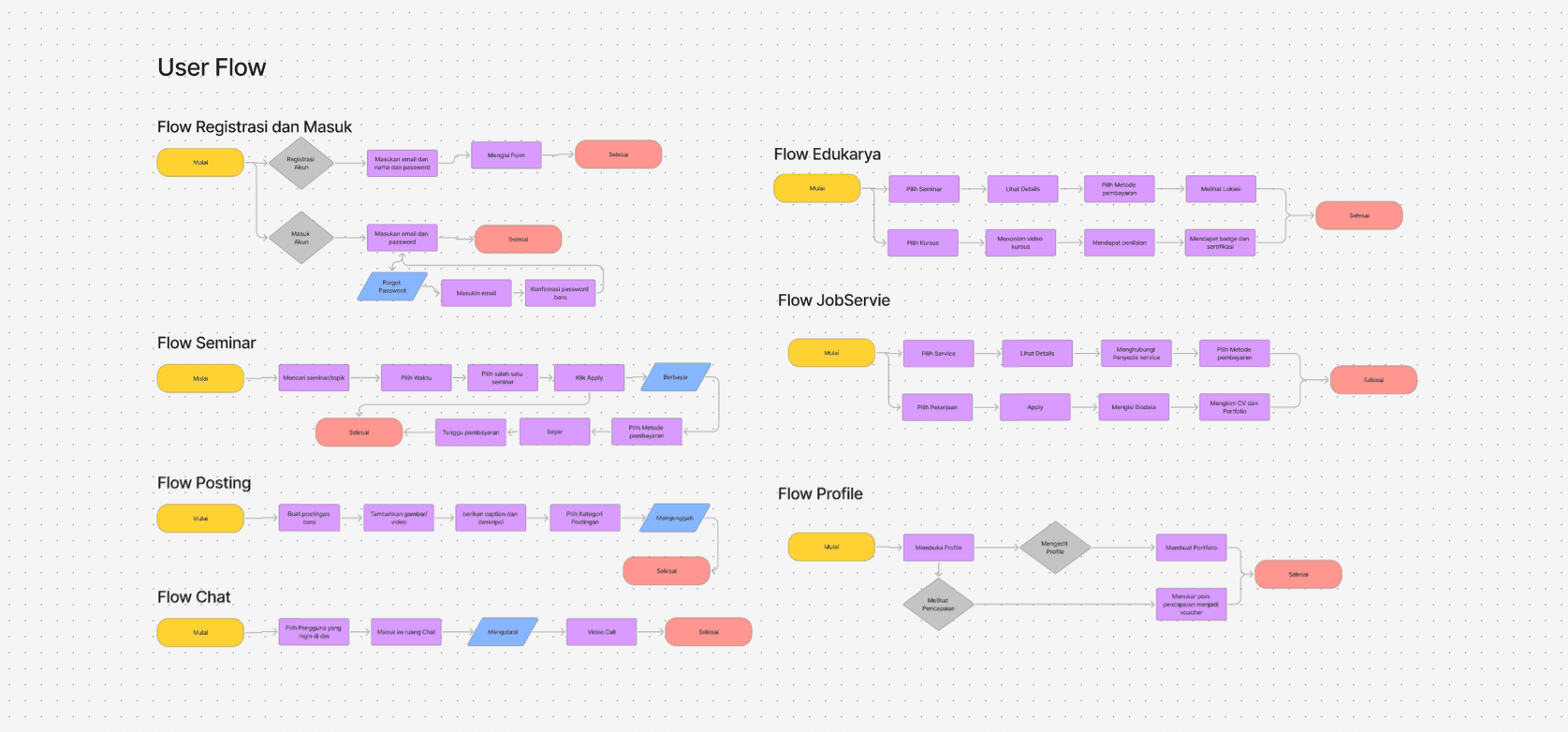
The user flow consists of several main flows that represent the user journey in various scenarios:
Registration and Login Flow
Users start by registering or logging in to their account. If they forget their password, they can recover it with a clear and structured flow.Flow Seminar
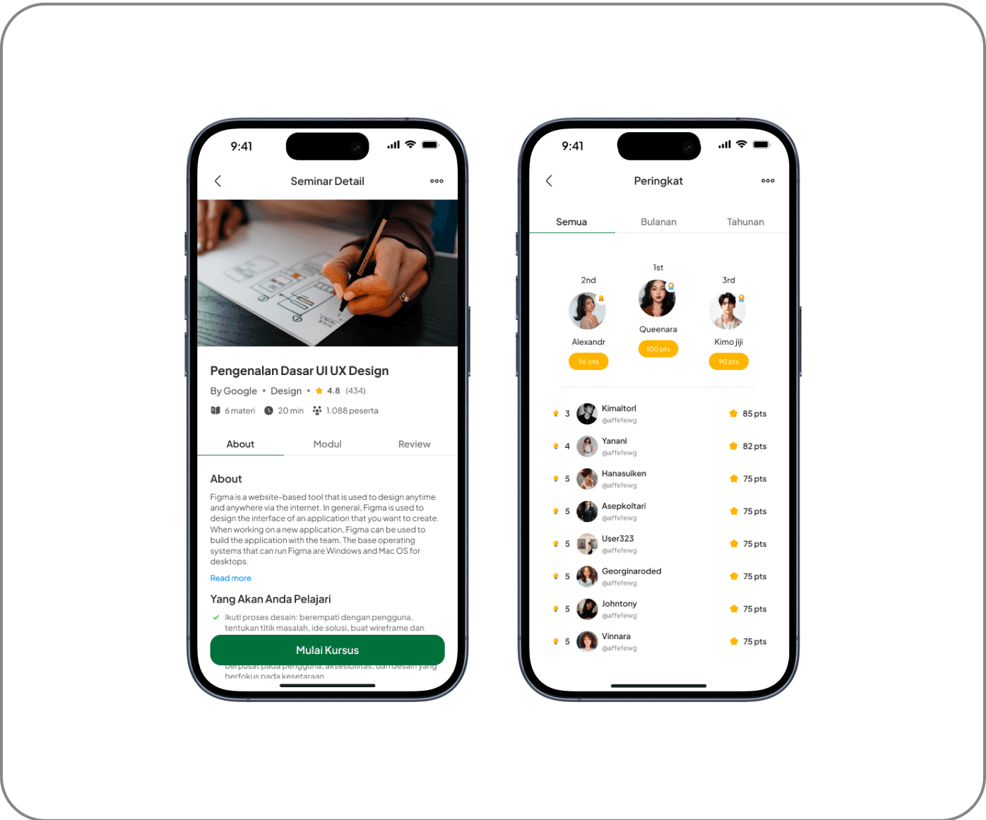
Users can search for seminars of interest, select a schedule, and make payment if necessary. After payment, they can access the seminar at the time they have chosen.Flow Edukarya
Users can choose a seminar or course, view details, make payments, and complete learning materials to get a certificate.Flow JobServie
Allows users to search for services or jobs, view details, contact service providers, fill in biodata, and submit CVs and portfolios to apply for jobs.Posting Flow
Users can create new posts, add images/videos, provide descriptions, select categories, and upload them for other users to see.Flow Chat
Users can select contacts to chat with, enter chat rooms, send messages, and make video calls if necessary.Flow Profile
Users can open and edit their profiles, create portfolios, and manage their achievements in the form of vouchers or awards.
Each flow is designed to provide a seamless and enjoyable experience for users, ensuring they can achieve their goals without any obstacles. With a collaborative approach, we ensure that each step in this user flow is not only functional but also human-centered.
Design System
In the app design development process, I collaborated with the team to create a Design System that serves as the main guide in maintaining visual consistency and interface functionality. Through intensive discussions, we designed a system that is flexible and easy to implement across different UI elements, ensuring a uniform and efficient user experience.
This design system focuses on several key aspects:
Uniform and easy-to-read typography
Color palette aligned with accessibility principles (WCAG 2.1)
Flexible and easily customizable UI components
Clear visual hierarchy to improve readability and navigation
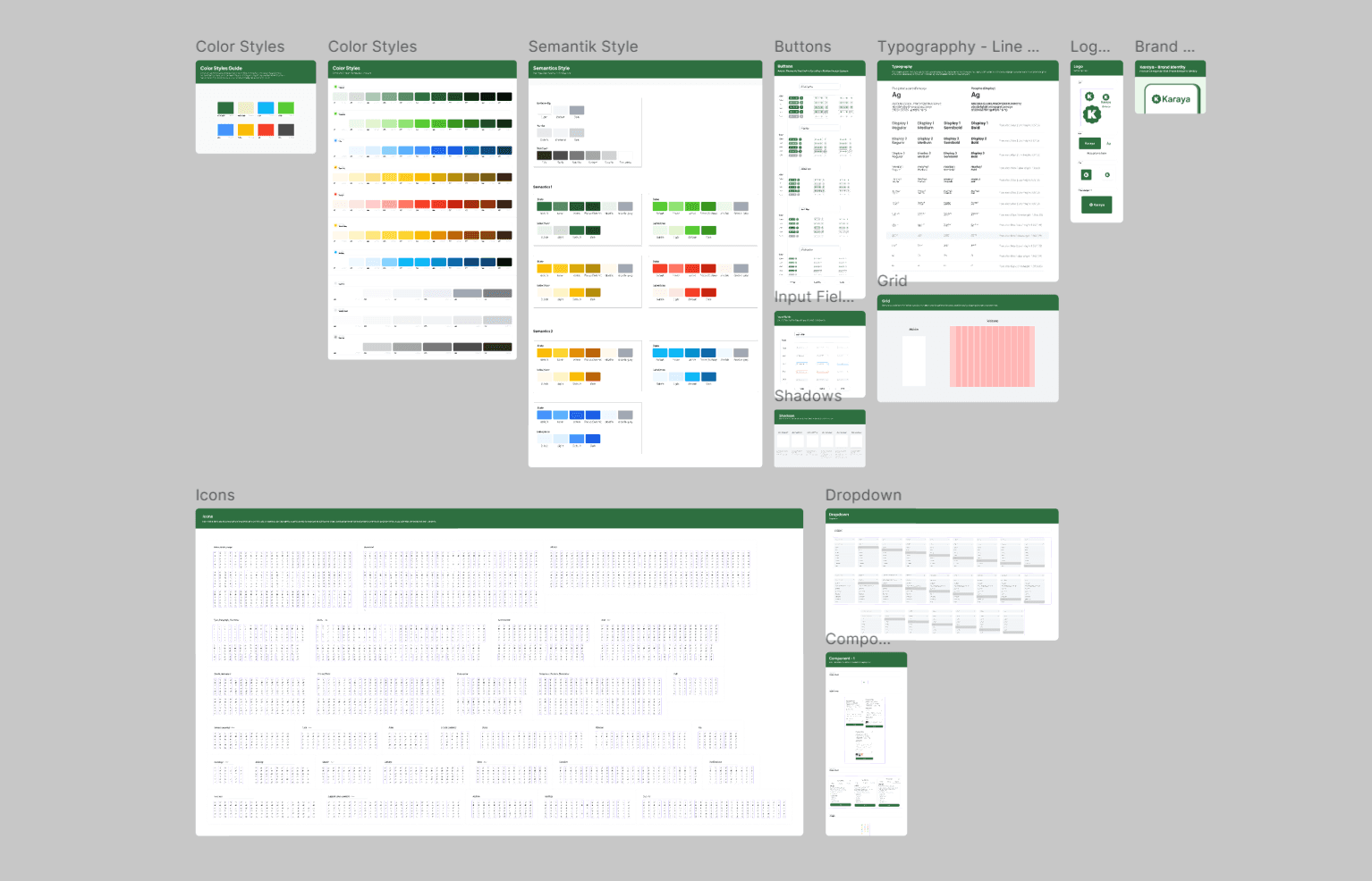
This system design includes several key components:
Color Styles & Semantic Style
We define a primary color palette, secondary colors, and semantic variations (such as colors for success, warning, or error statuses) to apply consistently across the app.
Category
Primary
Secondary
Accent
Success
Warning
Error
Neutral
Number
Forest Green
Cyan
Wheat Fields
Green
Yellow
Red
Grey
Code Hex
#2E6F40
#06B2F1
#F0EDCC
#5BD134
#F5BE0B
#FA442C
#4D4D4D
Karaya's color palette is designed to provide a balance between aesthetics and usability . The primary color Forest Green (#2E6F40) gives a professional and modern impression, while the other colors are used to support various UI elements.
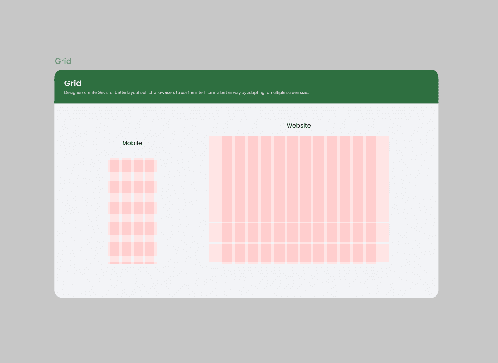
Typography & Grid System
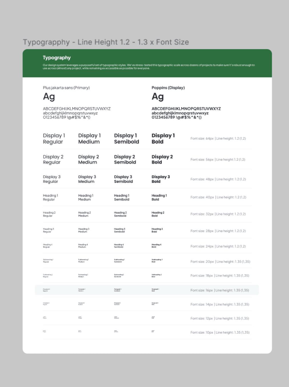
Typography is designed to ensure optimal readability with a variety of text sizes and line-height rules. This design system uses the Plus Jakarta Sans font as the main font and Poppins for display elements.
Buttons, Input Fields, and Dropdowns
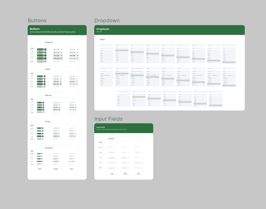
Each interactive component such as buttons, input fields, and dropdowns has been designed with various sizes and states ( default, hover, disabled ), so that it can be easily used by the development team.
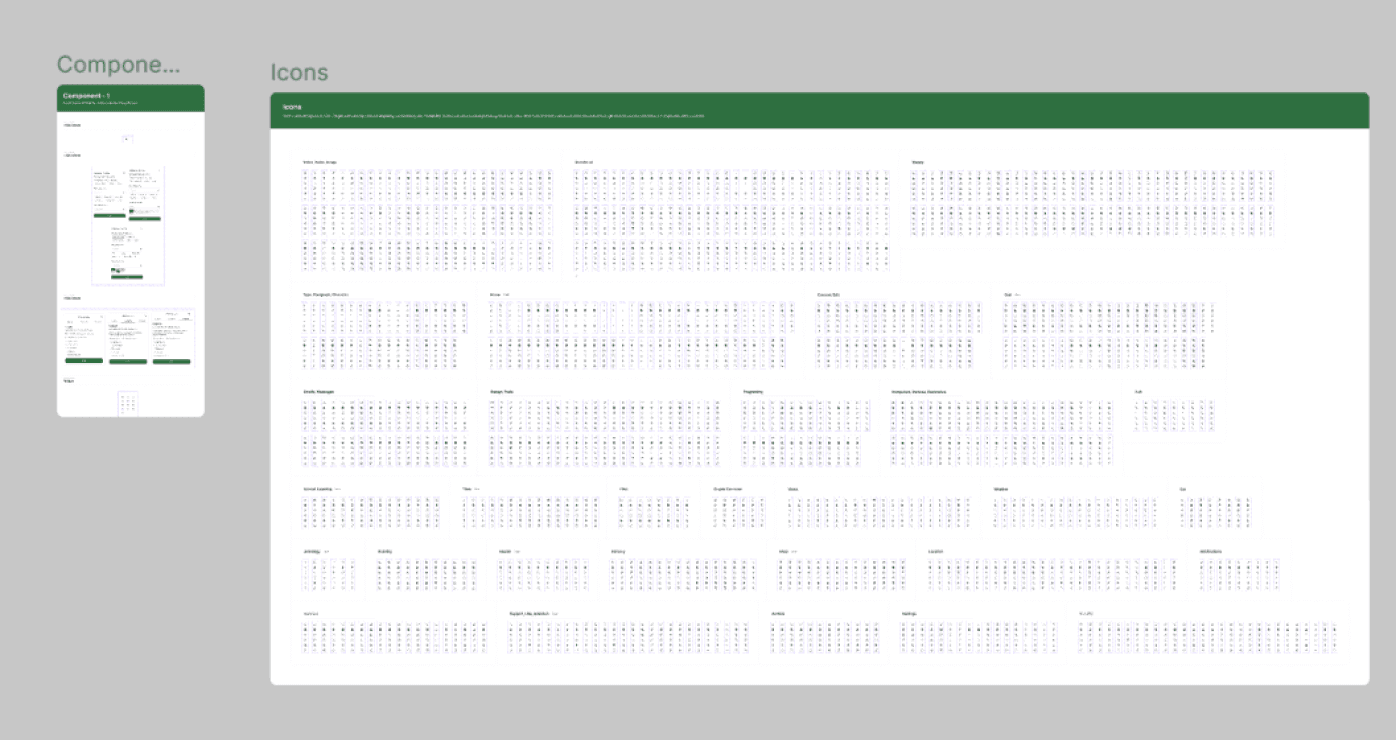
Icons & Components

The icon system is curated to reflect a uniform visual style, while other UI components such as cards, modals, and notifications are built to be reusable without sacrificing design flexibility.
Core Features
Based on the research, the platform features several key features designed to enhance users' productivity without compromising their social experience:
1. Homepage
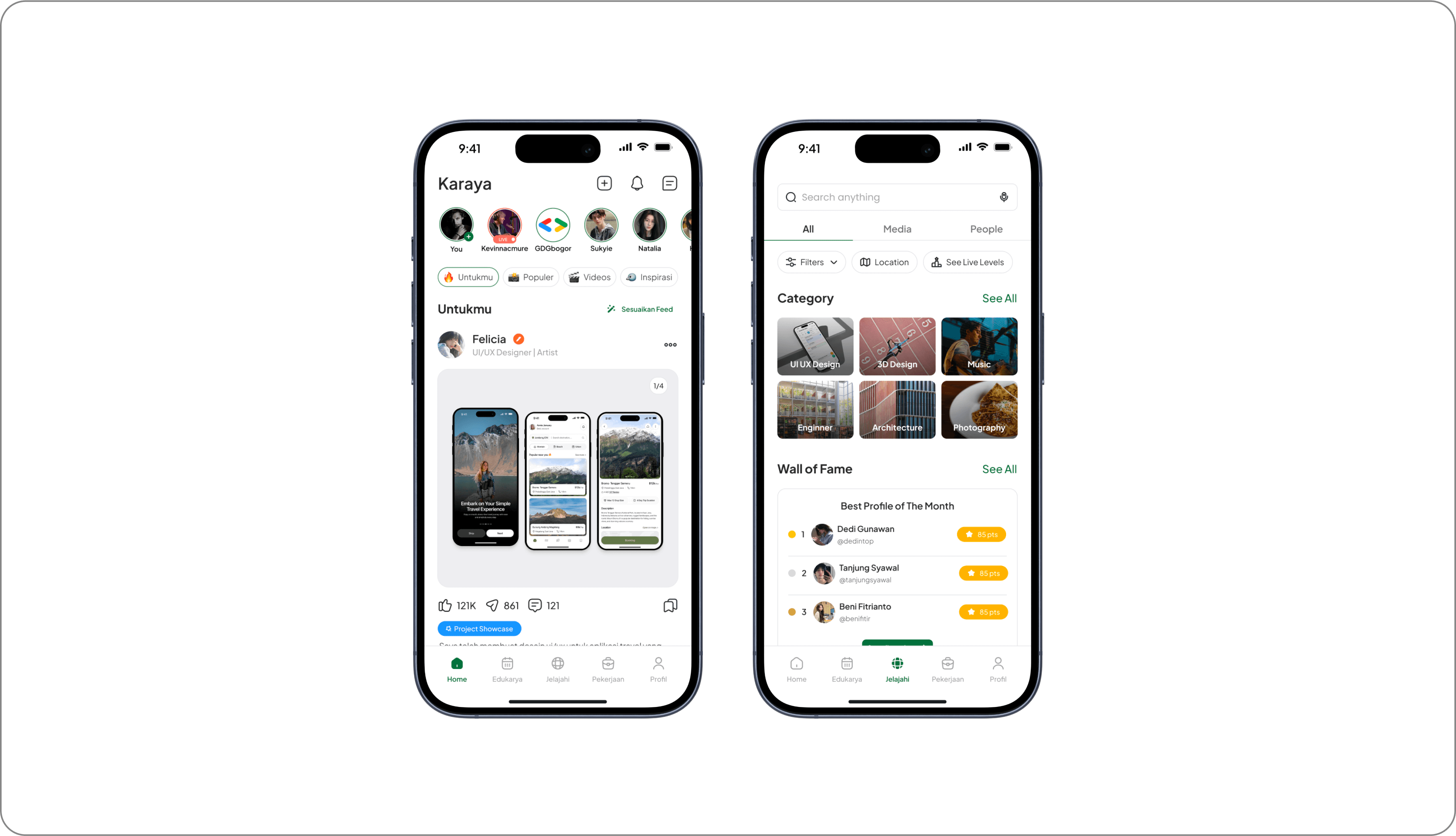
The exploration feature allows users to discover content from different categories in a dedicated tab. There is no AI-based automatic recommendation system, so users have full control over the content they want to see. Users can manually customize their feed based on personal preferences, ensuring that only relevant topics appear on their homepage.
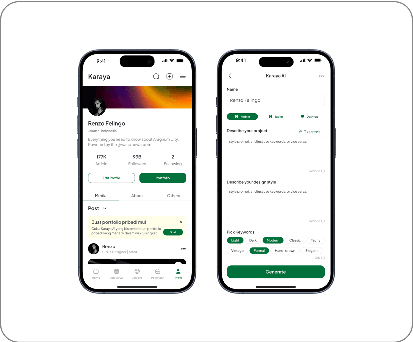
2. Portfolio Maker AI
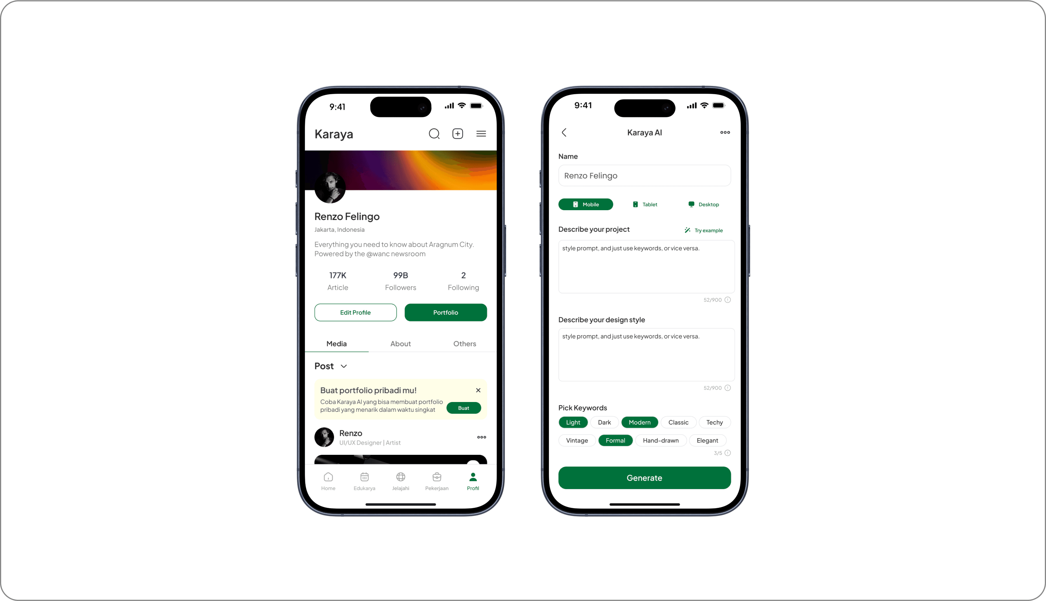
An automated system that helps users create a portfolio based on the project description and design preferences they enter. Users can choose the display format that suits their needs, including designs for Mobile, Tablet, or Desktop UI. In addition, keyword-based customization options are available that allow users to specify the visual or aesthetic elements they want to apply to their portfolio.
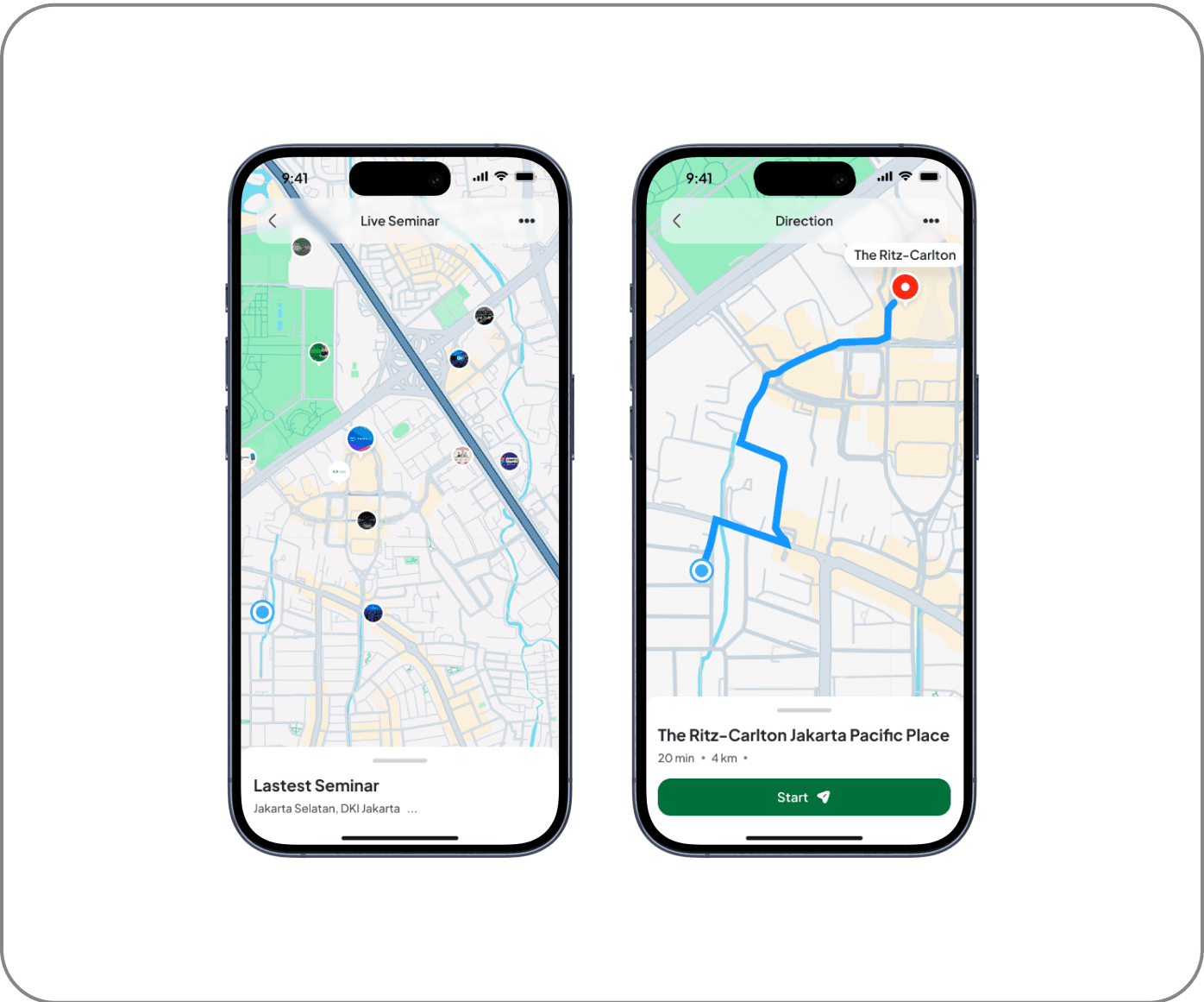
3. Live Map
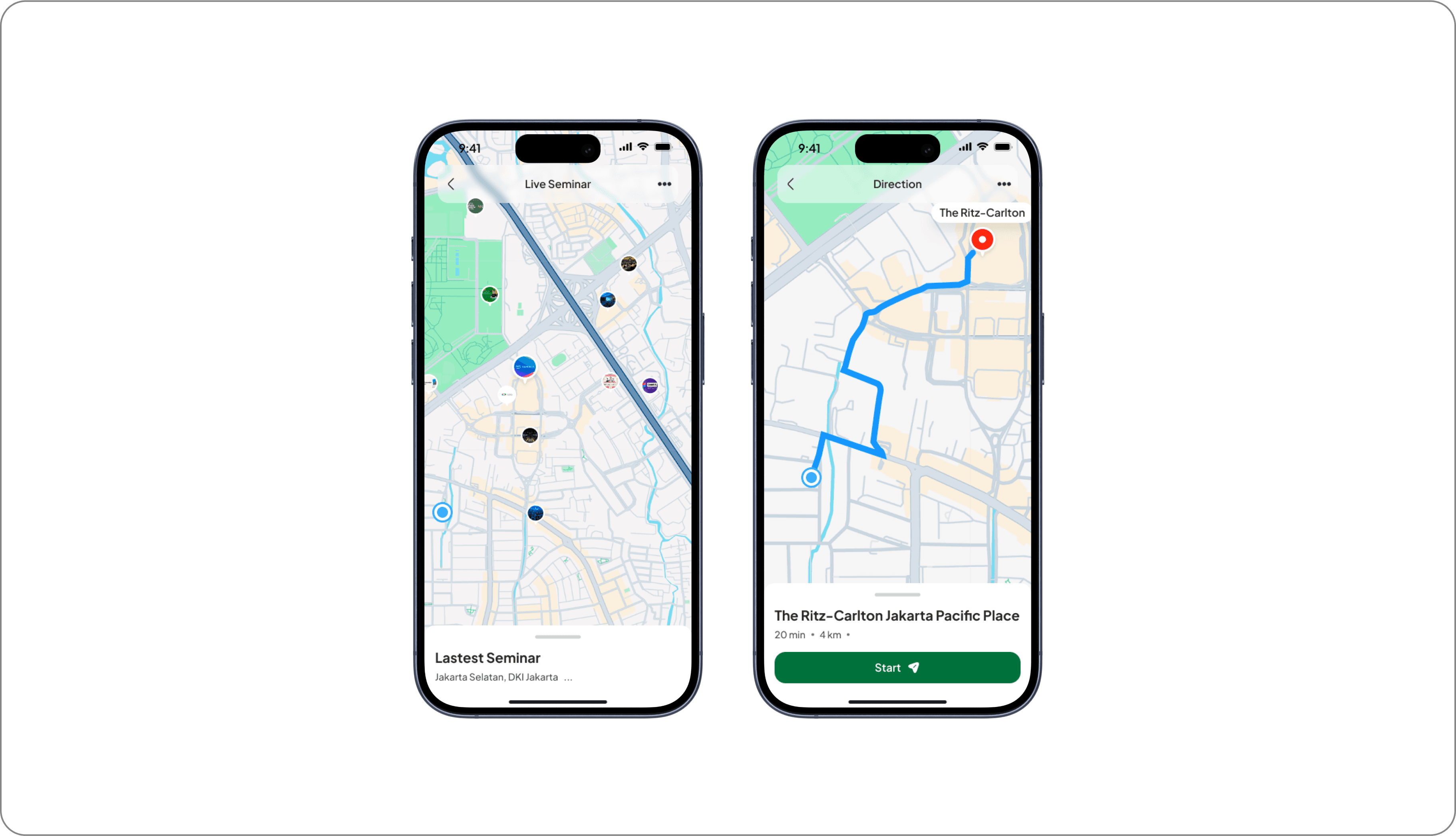
The Live Map & Direction feature is designed to help users find seminar locations more easily and accurately. With a real-time navigation system, users can view the best routes, estimated travel time, and available transportation options. Additionally, this feature provides live location updates, allowing participants to avoid delays and ensure timely arrival at their destination.
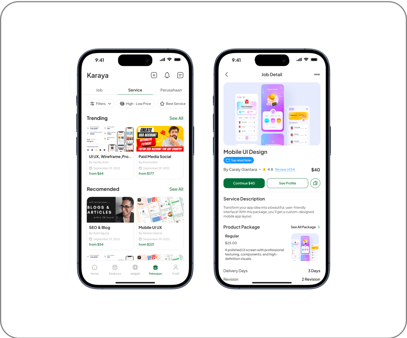
4. Freelance Marketplace & Profile Service
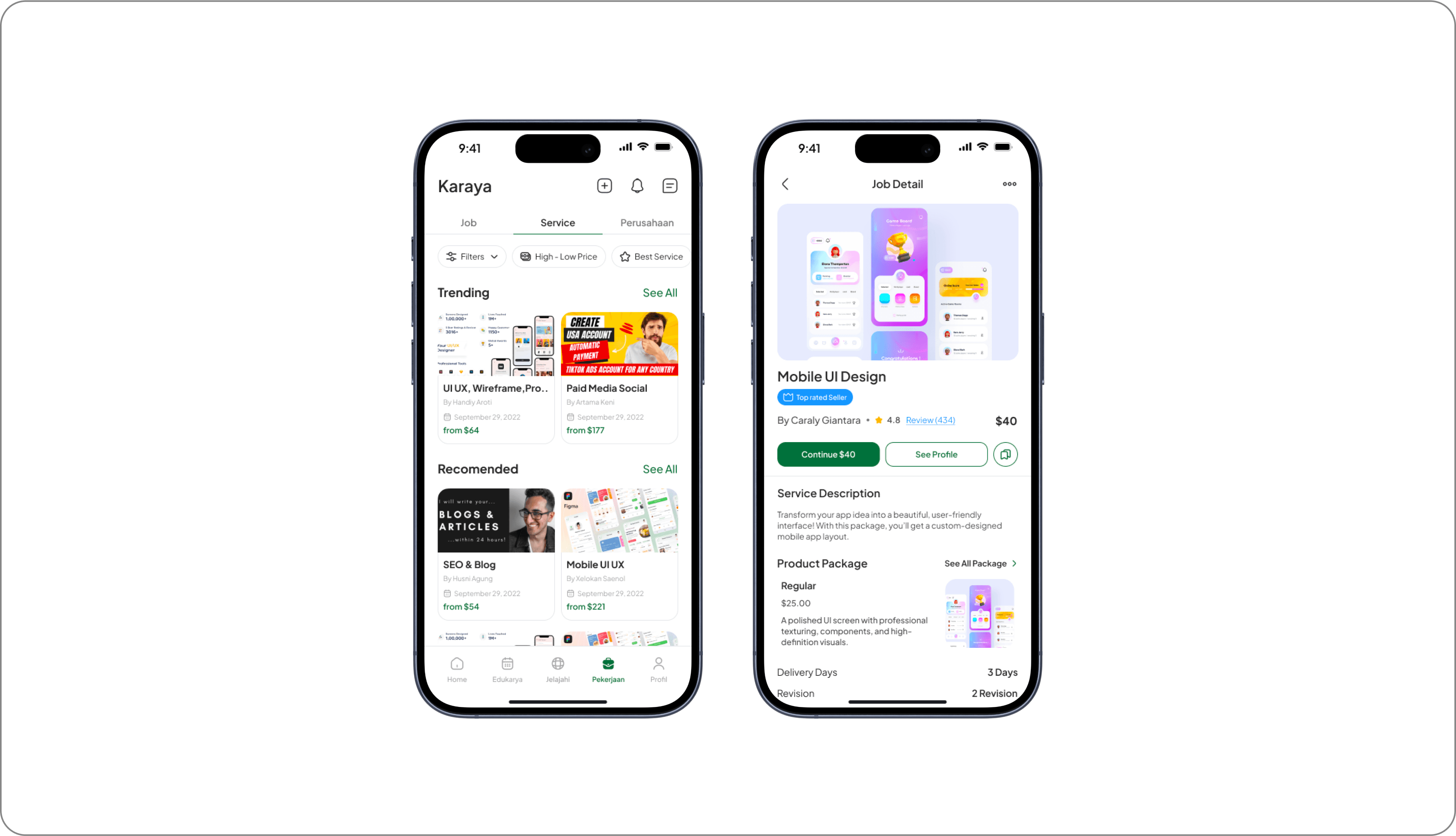
The marketplace serves as an additional feature in the user profile, allowing them to offer and sell freelance services directly within the platform. Each user can create the services they offer, while the rating and review system allows clients to assess the quality of the services provided. This feature provides transparency in transactions while helping freelancers build their professional reputation within the Karaya ecosystem.
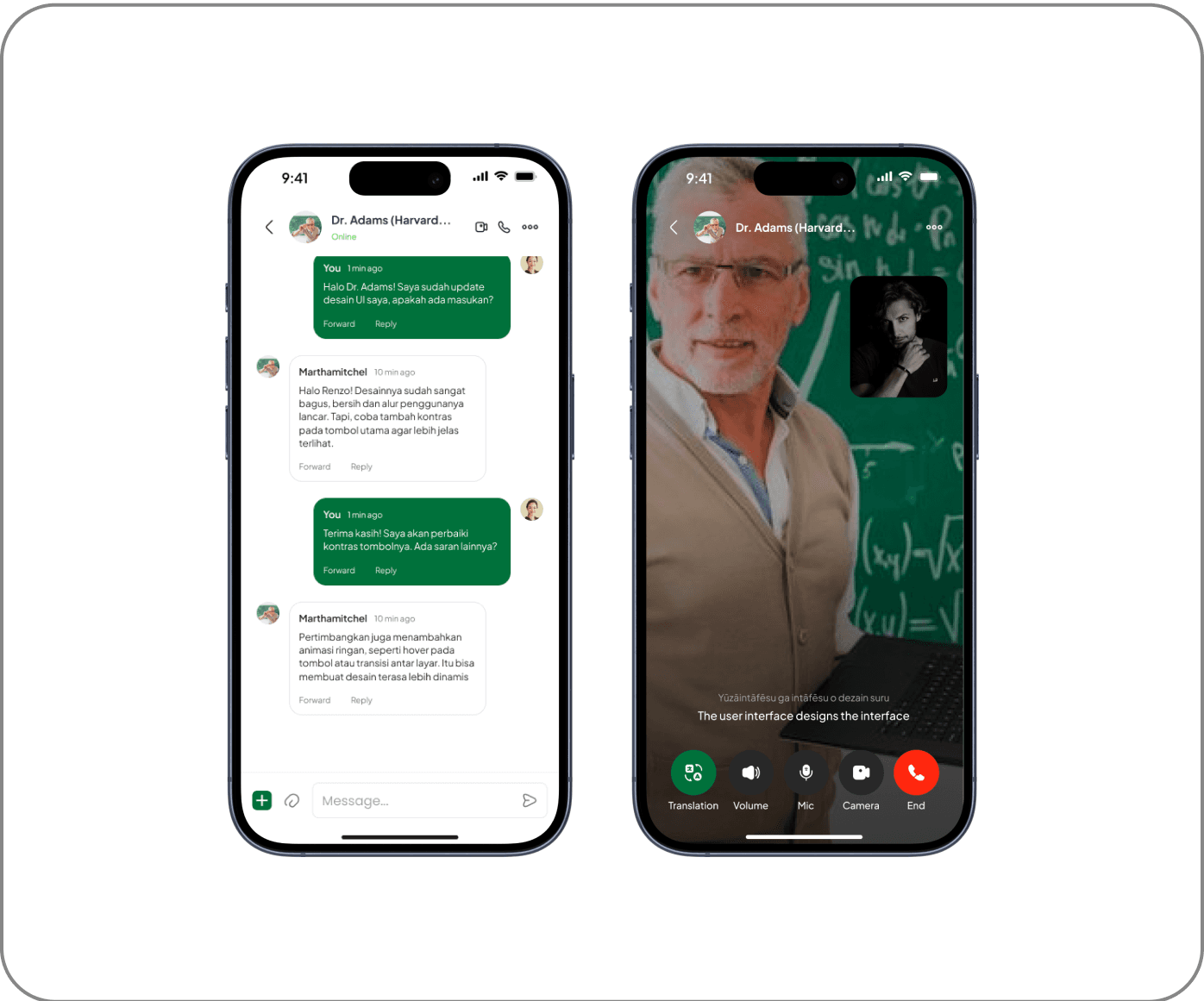
5. Auto Translated Communication System
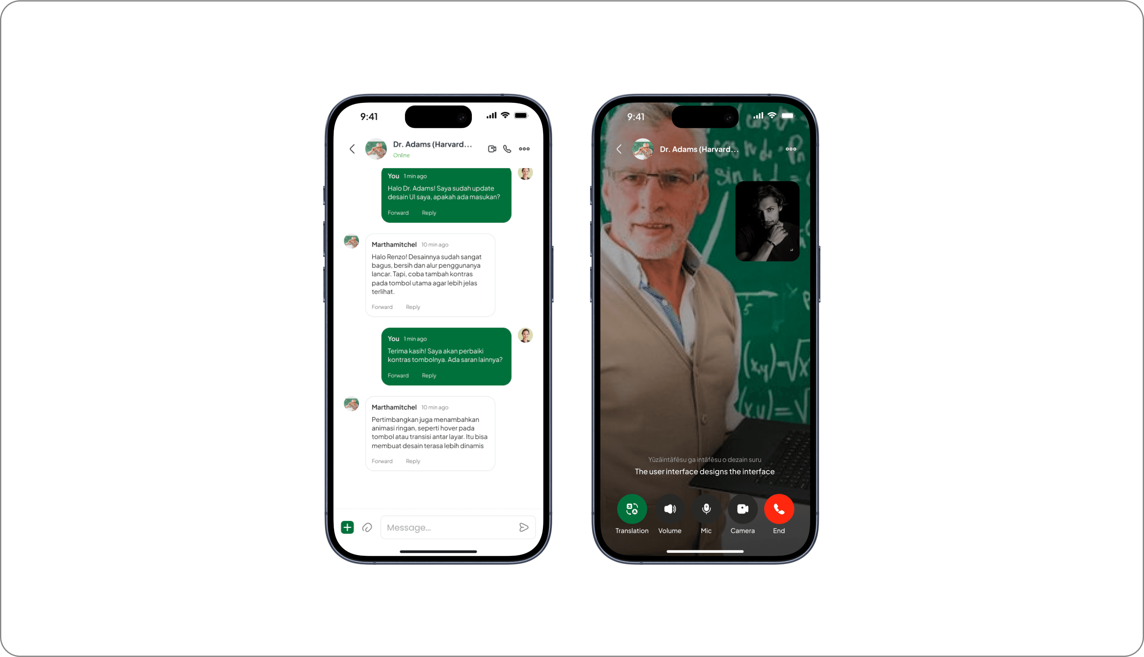
The communication system in this platform only provides a voice call feature for interaction between users. This feature aims to support discussions, mentoring, or consultations directly without using text. There is no real-time text translation feature, so communication only relies on voice as the main medium.
Skill-Based Learning with Leaderboard
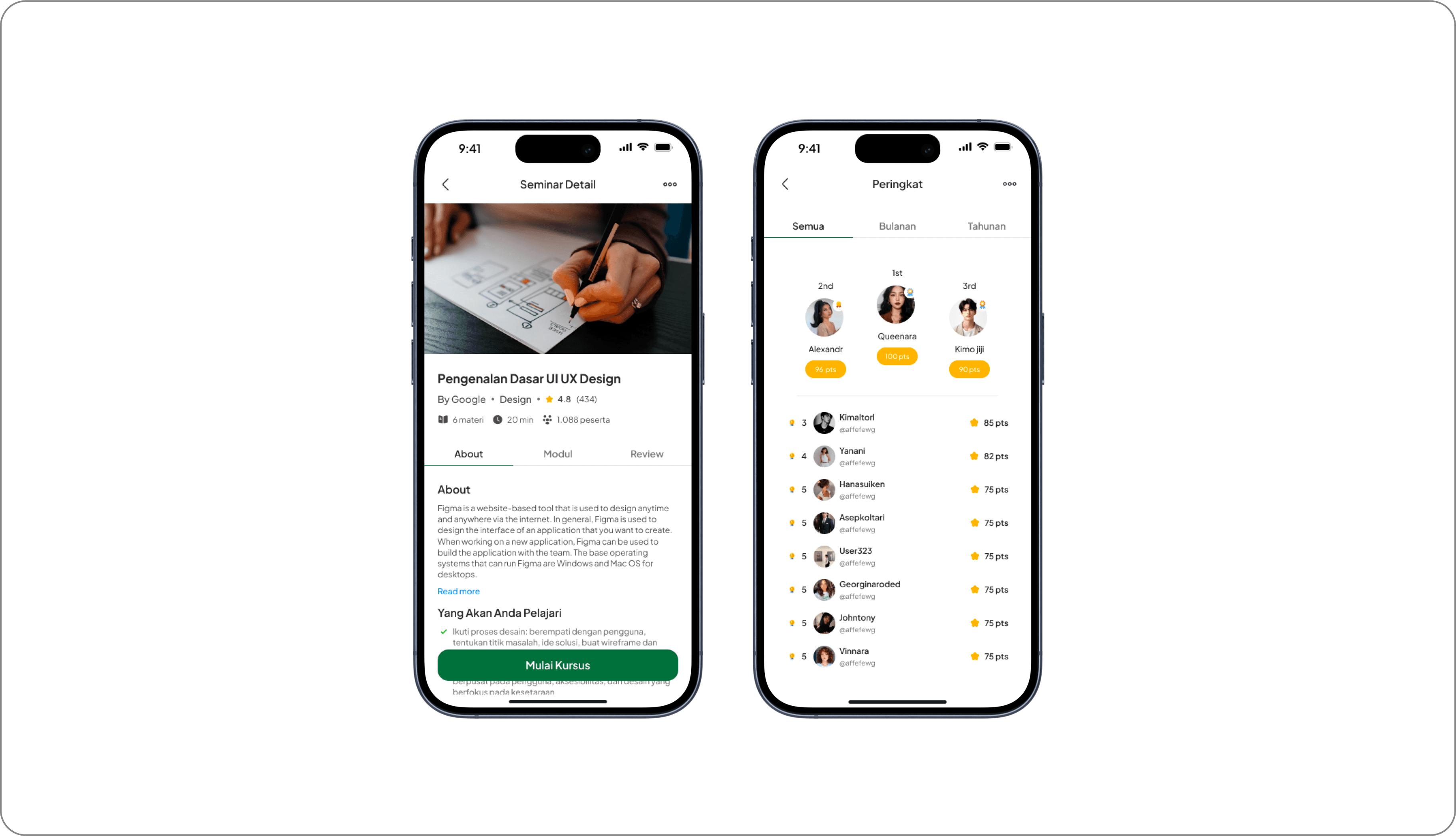
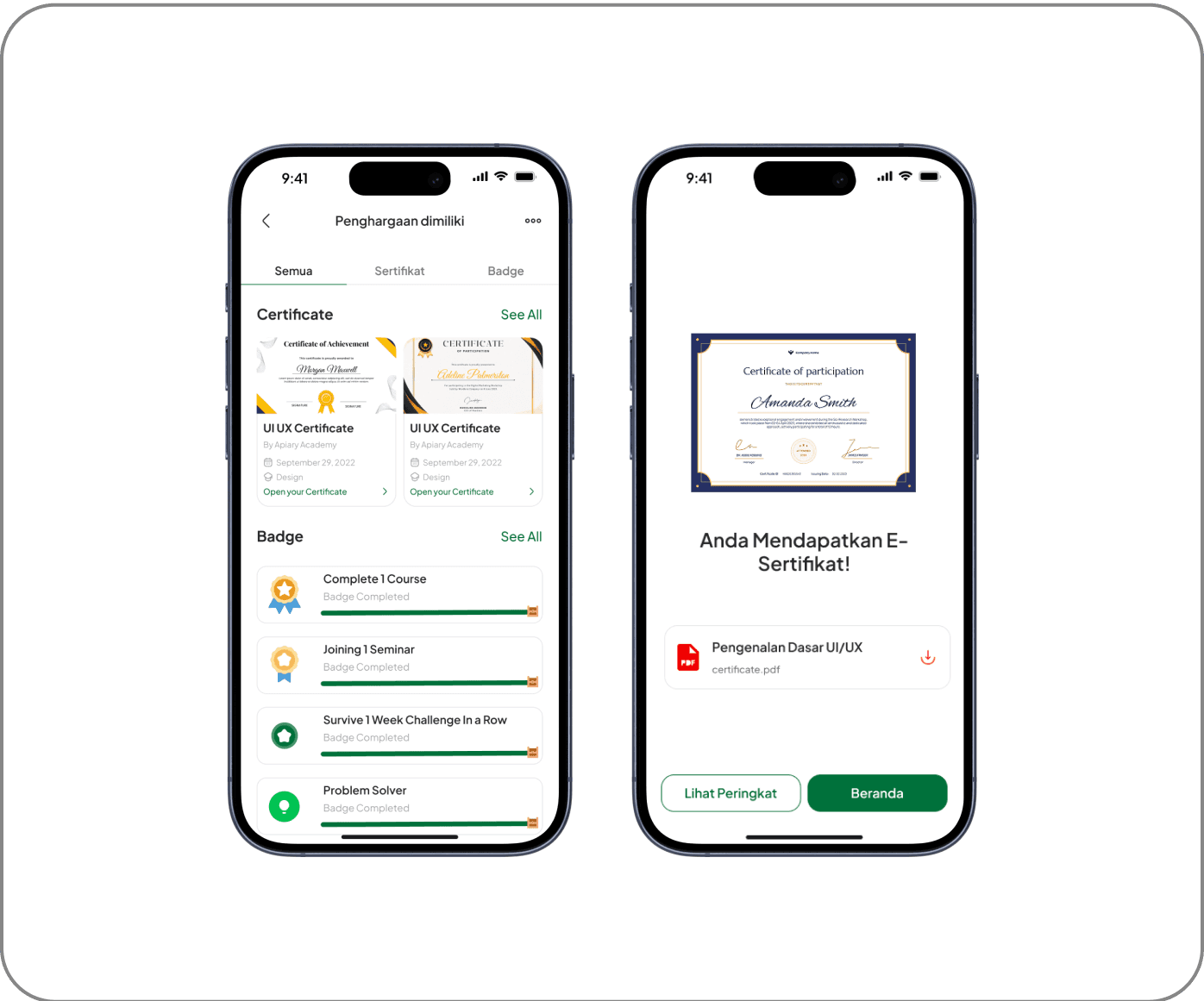
The platform focuses on courses that teach practical skills such as UI/UX, coding, business, and other fields. Each course available has a structured learning system, and users who successfully complete the course will receive an official certificate as proof of their achievement. This certificate can be used as a professional portfolio and displayed on the user's profile.
Skill Badge & Certification
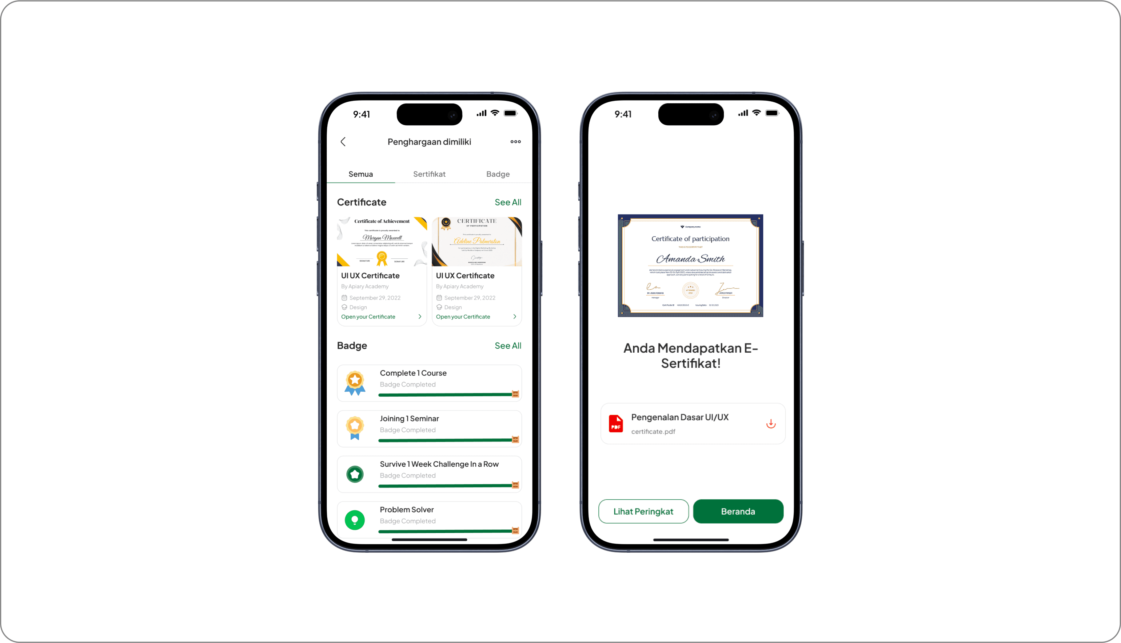
Users can display certificates from courses they have completed directly on their profile, similar to the feature found on LinkedIn. Additionally, there is an exclusive badge system that is awarded to users based on their accomplishments on the platform. These badges can serve as indicators of specific skills that users have mastered, providing additional validation of their abilities in their industry.
Validating User Experience
To ensure that the design really meets the needs of the users, we conducted usability testing that focused on several key aspects, such as task completion rate, user satisfaction score, and implementation of feedback for the next iteration. From the test results, we found that the platform has a high level of engagement, especially in the AI-Powered Portfolio Maker and Learning Features.
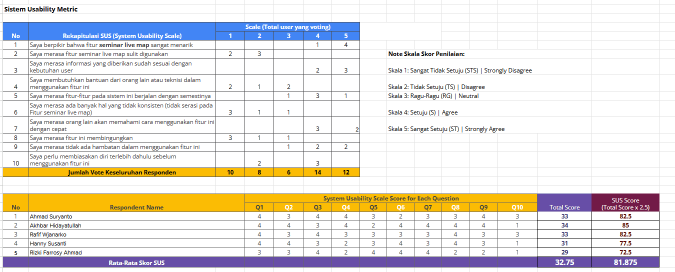
The test results showed that the product received a SUS Score of 81.875 (Excellent - Grade A), which indicates that the solution we developed has met the usability standards with satisfactory results. In addition, we also made improvements to the onboarding system based on direct feedback from users to make their initial experience more intuitive and efficient.
Reflection
Developing Karaya in a small team with only two people is a challenge. As a leader, I had to ensure that every design step was not only based on intuition, but also based on research and user needs. Effective collaboration is key: from intensive discussions on user behavior, brainstorming solutions, to feedback-based design iterations.
Despite limited resources, we focused on data-driven decision-making and user validation. As a result, the prototype we developed not only has an attractive appearance, but also proved effective in improving user experience based on usability testing.
Outcome
The results of this project proved that our design approach can compete at the national level. We achieved a Top 10 Finalist position in a national UI/UX competition, validating that our design has the potential to be further developed into a real product. In addition, testing showed that the platform managed to get a SUS Score of 81,875, which is categorized as Excellent (Grade A) in usability standards.
This success not only shows the effectiveness of the solution we designed but also opens up opportunities for further development into a Minimum Viable Product (MVP) that can be widely used by users.
Next Step Platform Improvement
Seeing its potential, this platform has the possibility to be further developed with several feature enhancements, such as:
AI-Based Career Guidance, which provides career recommendations based on users' interests and skills.
Job-Matching Integration, which connects users with job opportunities relevant to their skills.
Advanced Portfolio Customization, which allows users to customize the appearance and format of the portfolio as per the needs of different industries.
With the right development, this platform has the potential to become a solution that not only helps Gen Z in building a digital portfolio but also connects them with job opportunities and a wider professional network.
What I Would Improve?
From this experience, I came to understand how a design process can run effectively, especially in a small team. As a UI/UX Designer and Team Leader, I learned a lot about how to manage projects more strategically, ensure communication within the team remains smooth, and most importantly-make design decisions that are always based on research and user needs.
I also realized how crucial a data-driven approach to design is. By continuously iterating based on feedback from usability testing, we can continue to refine the product to truly fit the needs of users. In addition, I also gained valuable experience in usability testing, summarizing research results, and making more strategic design decisions.
Overall, this experience not only enriched my technical skills in UI/UX Design, but also strengthened my understanding of problem-solving, project management, and leadership in a collaborative design environment.
Karaya - Multifunctional Social App
Karaya is an innovative social media platform that integrates learning, career development, and professional networking ecosystems in one integrated digital solution. By providing accredited courses, industry-recognized certifications, and insightful interactive seminars, Karaya facilitates optimal skill enhancement. The advanced digital portfolio feature allows users to attractively showcase their competencies, thus opening up access to the best job opportunities with a streamlined recruitment process.

Date
19 Desember 2024
Software Used
Figma
Introduction
Why We Build Karaya?
Mage X UI/UX Design Competition is a national-level competition held by the Department of Computer Engineering, Faculty of FTEIC, Institut Teknologi Sepuluh Nopember Surabaya. This competition challenges UI/UX designers to create innovative, research-based digital solutions.
As the team leader and UI/UX designer, I played a crucial role in ensuring our solution was not only visually appealing but also highly functional. Through this journey, we successfully became Top 10 Finalists, proving that our design approach could compete at a national level.
Team And Role
In this project, our team consisted of two people, me as UI/UX Designer and Team Leader and my colleague as UX Researcher. As the team leader, I was responsible for setting the project vision and aligning the team's goals, making sure every design decision was always followed based on user needs data. I also lead brainstorming sessions to come up with solutions. In addition, I play a role in managing design execution from start to finish, ensuring each iteration has a positive impact on the user experience. Once the prototype was developed, I participated in usability testing, analyzed user feedback, and implemented improvements based on test results to refine the product design.
Problem Statement
One of the biggest challenges we identified was how to create a social media platform that remains engaging while simultaneously helping Gen Z prepare for their careers. Based on our research, 81% of Gen Z users struggle to find career-building platforms, while 67% want to build an online portfolio but don’t know where to start. Most existing platforms prioritize entertainment over productivity, leaving a significant gap in the market.
Objective
Karaya was designed with a primary purpose:
Key Takeaways
Listening directly to user needs is crucial to creating the right solution.
There is a big gap between what Gen Z wants and what platforms currently offer.
Design Process
My Design Journey From Concept to Execution
By applying the Design Thinking methodology, I ensure that every solution is user-centered and data-driven to create user-centric solutions, an iterative five-stage process that starts from a deep understanding of the user experience and their needs (Empathize), identifying key problems (Define), generating innovative solutions (Ideate), developing and testing prototypes (Prototype), and continuously refining the design through real-world testing (Test) to maximize effectiveness and relevance.
Understanding the Audience
To gain a deeper understanding of Gen Z's needs, we began by conducting in-depth interviews with Gen Z users to gather qualitative insights into their behaviors, preferences, and pain points:
After identifying key patterns and common themes, we expanded our research by conducting a survey using Google Forms. This allowed us to collect quantitative data from a larger user base and understand Gen Z's expectations:
Who Are Our Users?
After collecting and analyzing the data, I summarized the findings into project user personas. These personas include detailed information such as demographics, goals, motivations, pain points, and behavior patterns.
To ascertain the personas I discussed with the team to evaluate the shortcomings and needs of the personas. These discussions led to a good persona result and we were able to create a solution that really met the user's needs and increased overall user satisfaction.
Users Step-by-Step Experience
Once the User Persona was created, I took the lead to start designing the User Journey to understand and improve the overall user experience. This process started with in-depth research into the user's behavior and needs when using the platform, which I then mapped into stages of their interaction with the app.
Mapping the Core Issue
Based on our findings, we identified a key challenge:
Gen Z lacks an integrated platform that supports productivity through portfolio, learning, and networking, while still offering an engaging experience like conventional social media.
We identified the key issues that informed the development of this product. Gen Z needs an integrated platform that not only supports productivity such as portfolio creation, learning, and networking, but also still delivers an engaging interaction experience like any other social media.
Brainstorming for Innovation
In the Ideation phase, I took the lead in conducting brainstorming workshops to generate innovative solutions.
The brainstorming session we generated several solution ideas:
These ideas were chosen because they address productivity needs while maintaining the social elements that will help Gen Z to grow with social media.
My brainstorming contributions included: Portfolio Maker AI, Skill-Based Learning, and a Competitive Leaderboard
Visualizing the Concept
This section provides a visual representation of the high-fidelity (hi-fi) design developed based on previous research and idea exploration. Each element in the design has been strategically arranged to improve information affordability, interaction efficiency, and aesthetics in line with the product's purpose.
Creating the UX Flow
In creating these user flows, I collaborated with the team to understand how users would interact with the various features in the app. Using a discussion and research-based approach, we ensured that each flow reflected an intuitive and efficient user experience.
The user flow consists of several main flows that represent the user journey in various scenarios:
Registration and Login Flow
Users start by registering or logging in to their account. If they forget their password, they can recover it with a clear and structured flow.Flow Seminar
Users can search for seminars of interest, select a schedule, and make payment if necessary. After payment, they can access the seminar at the time they have chosen.Flow Edukarya
Users can choose a seminar or course, view details, make payments, and complete learning materials to get a certificate.Flow JobServie
Allows users to search for services or jobs, view details, contact service providers, fill in biodata, and submit CVs and portfolios to apply for jobs.Posting Flow
Users can create new posts, add images/videos, provide descriptions, select categories, and upload them for other users to see.Flow Chat
Users can select contacts to chat with, enter chat rooms, send messages, and make video calls if necessary.Flow Profile
Users can open and edit their profiles, create portfolios, and manage their achievements in the form of vouchers or awards.
Each flow is designed to provide a seamless and enjoyable experience for users, ensuring they can achieve their goals without any obstacles. With a collaborative approach, we ensure that each step in this user flow is not only functional but also human-centered.
Design System
In the app design development process, I collaborated with the team to create a Design System that serves as the main guide in maintaining visual consistency and interface functionality. Through intensive discussions, we designed a system that is flexible and easy to implement across different UI elements, ensuring a uniform and efficient user experience.
This design system focuses on several key aspects:
Uniform and easy-to-read typography
Color palette aligned with accessibility principles (WCAG 2.1)
Flexible and easily customizable UI components
Clear visual hierarchy to improve readability and navigation
This system design includes several key components:
Color Styles & Semantic Style
We define a primary color palette, secondary colors, and semantic variations (such as colors for success, warning, or error statuses) to apply consistently across the app.
Category
Primary
Secondary
Accent
Success
Warning
Error
Neutral
Number
Forest Green
Cyan
Wheat Fields
Green
Yellow
Red
Grey
Code Hex
#2E6F40
#06B2F1
#F0EDCC
#5BD134
#F5BE0B
#FA442C
#4D4D4D
Karaya's color palette is designed to provide a balance between aesthetics and usability . The primary color Forest Green (#2E6F40) gives a professional and modern impression, while the other colors are used to support various UI elements.
Typography & Grid System
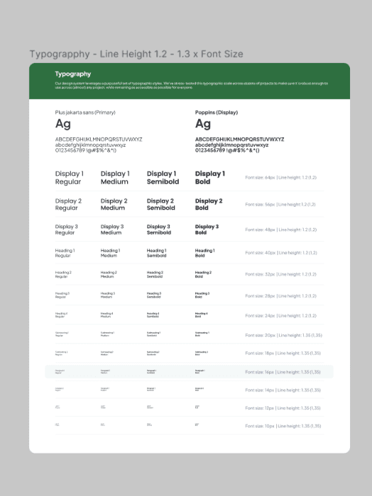
Typography is designed to ensure optimal readability with a variety of text sizes and line-height rules. This design system uses the Plus Jakarta Sans font as the main font and Poppins for display elements.
Buttons, Input Fields, and Dropdowns
Each interactive component such as buttons, input fields, and dropdowns has been designed with various sizes and states ( default, hover, disabled ), so that it can be easily used by the development team.
Icons & Components
The icon system is curated to reflect a uniform visual style, while other UI components such as cards, modals, and notifications are built to be reusable without sacrificing design flexibility.
Core Features
Based on the research, the platform features several key features designed to enhance users' productivity without compromising their social experience:
1. Homepage
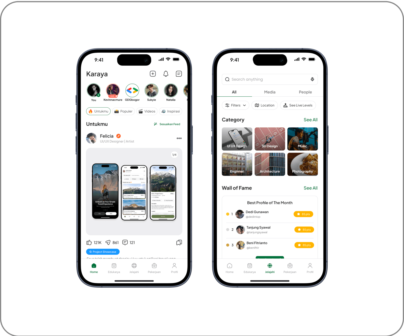
The exploration feature allows users to discover content from different categories in a dedicated tab. There is no AI-based automatic recommendation system, so users have full control over the content they want to see. Users can manually customize their feed based on personal preferences, ensuring that only relevant topics appear on their homepage.
2. Portfolio Maker AI
An automated system that helps users create a portfolio based on the project description and design preferences they enter. Users can choose the display format that suits their needs, including designs for Mobile, Tablet, or Desktop UI. In addition, keyword-based customization options are available that allow users to specify the visual or aesthetic elements they want to apply to their portfolio.
3. Live Map
The Live Map & Direction feature is designed to help users find seminar locations more easily and accurately. With a real-time navigation system, users can view the best routes, estimated travel time, and available transportation options. Additionally, this feature provides live location updates, allowing participants to avoid delays and ensure timely arrival at their destination.
4. Freelance Marketplace & Profile Service
The marketplace serves as an additional feature in the user profile, allowing them to offer and sell freelance services directly within the platform. Each user can create the services they offer, while the rating and review system allows clients to assess the quality of the services provided. This feature provides transparency in transactions while helping freelancers build their professional reputation within the Karaya ecosystem.
5. Auto Translated Communication System
The communication system in this platform only provides a voice call feature for interaction between users. This feature aims to support discussions, mentoring, or consultations directly without using text. There is no real-time text translation feature, so communication only relies on voice as the main medium.
Skill-Based Learning with Leaderboard
The platform focuses on courses that teach practical skills such as UI/UX, coding, business, and other fields. Each course available has a structured learning system, and users who successfully complete the course will receive an official certificate as proof of their achievement. This certificate can be used as a professional portfolio and displayed on the user's profile.
Skill Badge & Certification
Users can display certificates from courses they have completed directly on their profile, similar to the feature found on LinkedIn. Additionally, there is an exclusive badge system that is awarded to users based on their accomplishments on the platform. These badges can serve as indicators of specific skills that users have mastered, providing additional validation of their abilities in their industry.
Validating User Experience
To ensure that the design really meets the needs of the users, we conducted usability testing that focused on several key aspects, such as task completion rate, user satisfaction score, and implementation of feedback for the next iteration. From the test results, we found that the platform has a high level of engagement, especially in the AI-Powered Portfolio Maker and Learning Features.
The test results showed that the product received a SUS Score of 81.875 (Excellent - Grade A), which indicates that the solution we developed has met the usability standards with satisfactory results. In addition, we also made improvements to the onboarding system based on direct feedback from users to make their initial experience more intuitive and efficient.
Reflection
Developing Karaya in a small team with only two people is a challenge. As a leader, I had to ensure that every design step was not only based on intuition, but also based on research and user needs. Effective collaboration is key: from intensive discussions on user behavior, brainstorming solutions, to feedback-based design iterations.
Despite limited resources, we focused on data-driven decision-making and user validation. As a result, the prototype we developed not only has an attractive appearance, but also proved effective in improving user experience based on usability testing.
Outcome
The results of this project proved that our design approach can compete at the national level. We achieved a Top 10 Finalist position in a national UI/UX competition, validating that our design has the potential to be further developed into a real product. In addition, testing showed that the platform managed to get a SUS Score of 81,875, which is categorized as Excellent (Grade A) in usability standards.
This success not only shows the effectiveness of the solution we designed but also opens up opportunities for further development into a Minimum Viable Product (MVP) that can be widely used by users.
Next Step Platform Improvement
Seeing its potential, this platform has the possibility to be further developed with several feature enhancements, such as:
AI-Based Career Guidance, which provides career recommendations based on users' interests and skills.
Job-Matching Integration, which connects users with job opportunities relevant to their skills.
Advanced Portfolio Customization, which allows users to customize the appearance and format of the portfolio as per the needs of different industries.
With the right development, this platform has the potential to become a solution that not only helps Gen Z in building a digital portfolio but also connects them with job opportunities and a wider professional network.
What I Would Improve?
From this experience, I came to understand how a design process can run effectively, especially in a small team. As a UI/UX Designer and Team Leader, I learned a lot about how to manage projects more strategically, ensure communication within the team remains smooth, and most importantly-make design decisions that are always based on research and user needs.
I also realized how crucial a data-driven approach to design is. By continuously iterating based on feedback from usability testing, we can continue to refine the product to truly fit the needs of users. In addition, I also gained valuable experience in usability testing, summarizing research results, and making more strategic design decisions.
Overall, this experience not only enriched my technical skills in UI/UX Design, but also strengthened my understanding of problem-solving, project management, and leadership in a collaborative design environment.
Back to Works